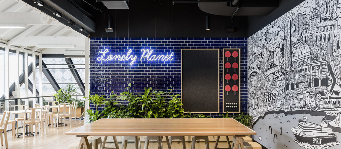
Last week, I received an email in my inbox inviting me down to check out Lonely Planet’s new headquarters in Carlton in Melbourne. Wait a minute, let me just see if I can fit that into my schedule… I immediately accepted (of course) and so headed down to tour the new home of the world’s leading travel media company in The Malt Store heritage building in Melbourne’s inner-north. I tell you what, as much as I adore the freelance travel writing life, I could totally go back to the 9-5 if this is what it looked like. I’ll show you why.
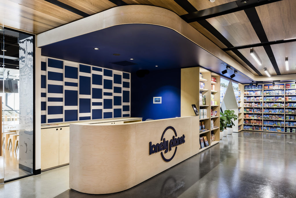
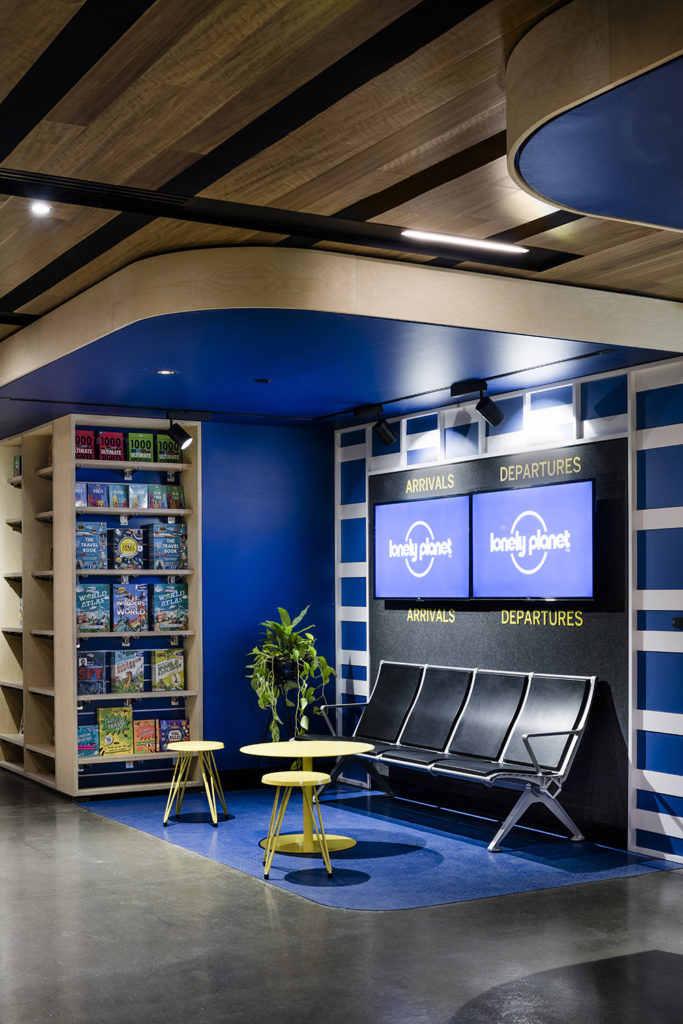
When the elevator doors delivered me to the 3rd floor, the reception, I almost did a double take. Was I in an airport lounge or Lonely Planet HQ? The waiting area had been designed with arrivals and departures boards, airport-style seating and reading material to peruse, all elements carefully conceptualised to create the feeling that guests were about to embark on a journey.
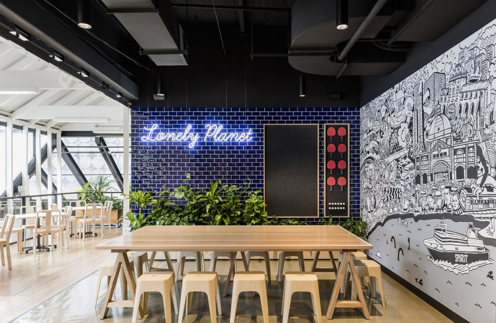
Behind reception is the communal kitchen and chill-out space complete with a table tennis table (staff can play during the hours of 8-9am and after 4pm). I especially loved the black and white artwork that adorned one of the walls, detailing Melbourne landmarks as well as Lonely Planet founders, Tony and Maureen Wheeler themselves. After all, this is where it all started, here in Melbourne.
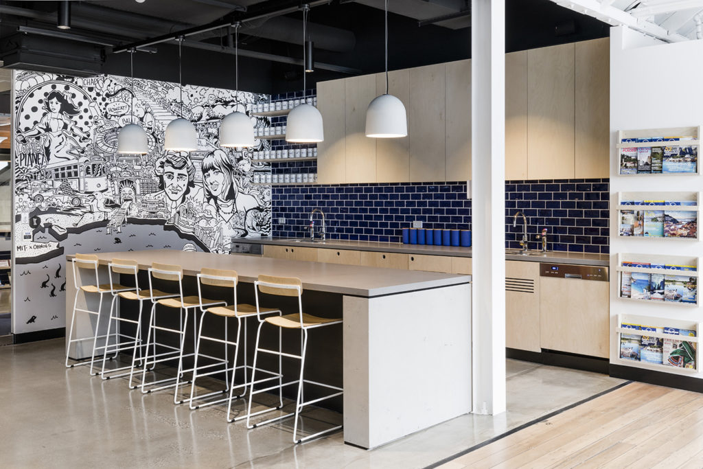
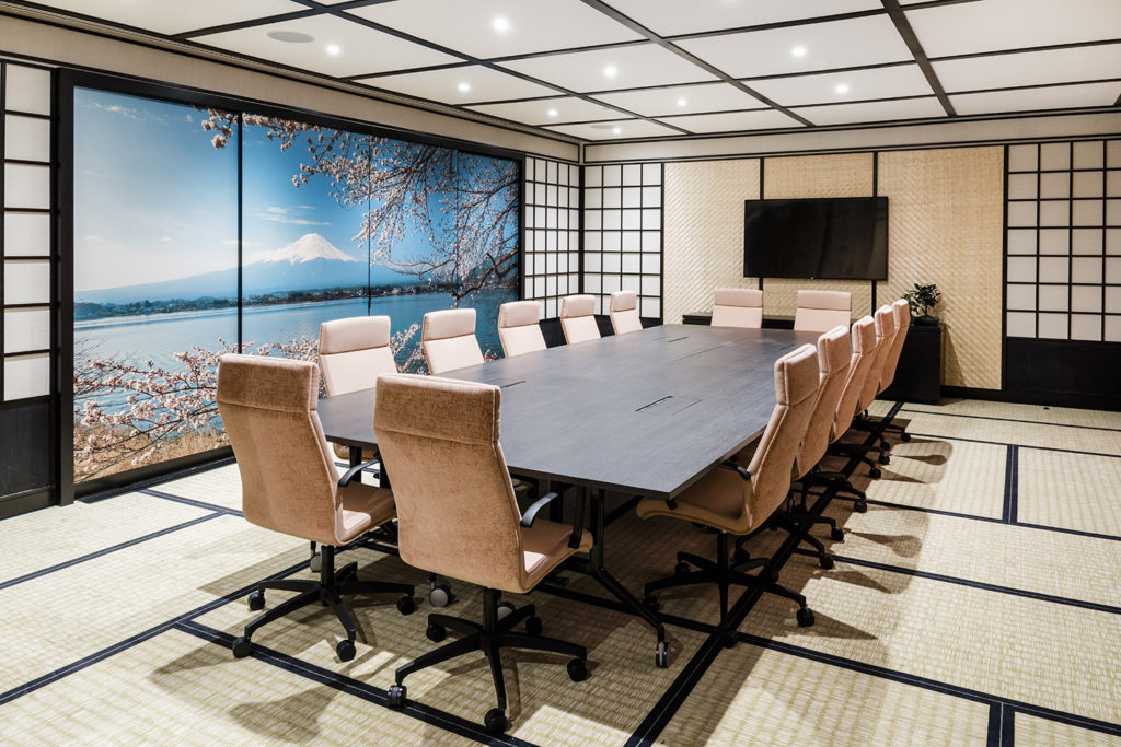
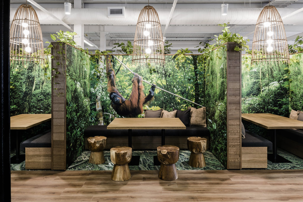
Despite what many would think, Lonely Planet writers aren’t out travelling nearly as much as they’d like to be, so the design concept behind the new headquarters was to bring the world to the staff. Wandering through the space, it became clear that the custom design and fit-out reflects a series of destination ‘zones’. From board rooms aiming to transport staff to Mount Fuji to breakout spaces that mimicked the lush jungles of Borneo, writers could traverse the globe all in a day’s work.
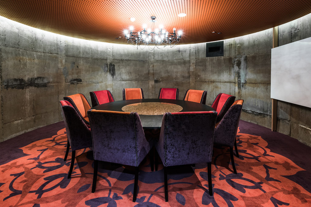
The other important consideration for the acclaimed Siren Design Group entrusted with the project was how best to maximise the architectural elements of the historic Malt Store building. On Level 2, the original concrete vats (the first of their kind in the southern hemisphere) remain and have been repurposed as meeting rooms. Normally one to cringe at the thought of workplace meetings, if this were my workplace I think I’d be finding any excuse to schedule them left right and centre!
Most workspaces are drab, grey and to be honest, kinda depressing. But the workspaces here at Lonely Planet HQ actually make staff inspired and excited to come to work each day. They’re colourful, sensory and inspire creativity and have staff feeling as though they’re actually writing in the field rather than out of an office.
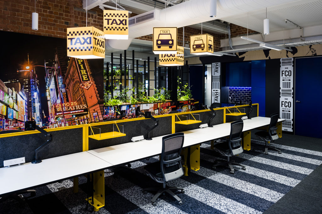
If ever there were a dream office, this has got to be it. Now, excuse me while I check for job openings.


Wow these are incredible! I am working a summer job in the TripAdvisor Global HQ, and I have to say it is not nearly as detailed as this one. Each floor is a continent and each meeting room is a country in that continent, but the office spaces are bland and ordinary 🙁 This looks like a great place to work!
This is GORGEOUS! Can we have team meetings here?! 🙂
Isn’t it! Future DOW dream office for sure!